Pie chart is one of the most common used charts in Excel. It’s often used in market share analysis, market occupancy analysis and some other occasions since it can express the proportion of each area intuitively.
The way to insert a pie chart in Excel is much like the method of making a line chart, which I’ve introduced in my previous post.
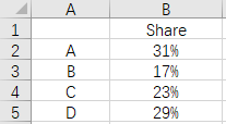
1. First of all, you need a table shows the proportion of each part in the total quantity as source data.
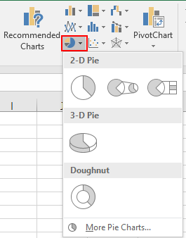
2. Click Insert, then the icon of pie chart. Choose the style you like.
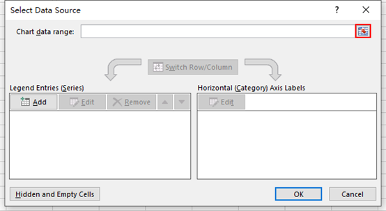
3. Click Select Data and hit the small icon beside Chart data range in the popping out window.
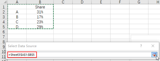
4. Select the range of data manually till the description is added to the textbox automatically. Hit that small icon again to go back to Select Data Source window.
5. Check the content in Legend Entries (Series) and Horizontal (Category) Axis Labels.
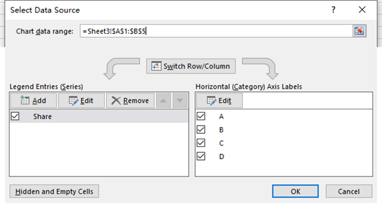
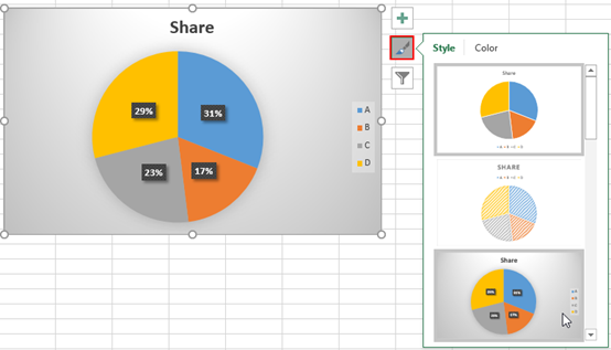
6. Click OK then these data will be applied to the new chart. You can customize the style and color by clicking the brush icon next to it.

Glad to be one of many visitors on this awesome internet site : D.