If you need to make a chart reflecting the changes in specific data, line chart is a good choice. In this post I’ll introduce the way to insert a line chart in Excel.
Here’s a table records the incomes of A and B from January to December.

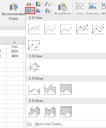
1. Now I want to make a line chart according to the data in it, the first step is switching to Insert tab and choosing the icon of line chart in Charts section.

2. Choose the style you like to insert a line chart. For now, you can see, the selected area is still blank since you haven’t specified the range of data.

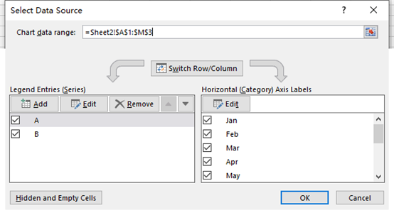
3. Click Select Data in Design (Chart Tools) tab. The Select Data Source window will pop out.
4. Click the small icon beside the textbox of Chart data range, you can then choose the range of data manually. Drag the mouse to select the whole table and click that icon again.

5. Check the content in Legend Entries (Series) and Horizontal (Category) Axis Labels. If it doesn’t meet your needs, you can make some adjustments separately.

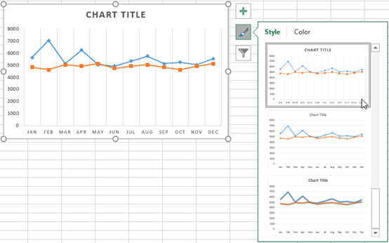
6. Hit OK and then a new line chart is created. If you are still not satisfied with the appearance of it, select the brush icon to choose the style and color you like.


Leave a Reply