We’ve already shared the tip of how to insert line chart, pie chart and histogram in Excel, but sometimes they cannot meet the needs of data analysis. Here is another type——radar chart, which is equivalent to a parallel coordinates plot, with the axes arranged radially, and also a useful way to display multivariate observations with an arbitrary number of variables. So how can we insert a radar chart? Here’s a simple guide.
1. Enter all data you want to analyze, here I will take the income for past three years as an example.

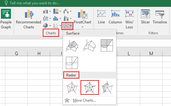
2. Select all items, and go to Insert tab, click Radar Chart button in Charts group, and you can select one from three symbols in the drop-down list of Rader section. Here I prfer the second type, which means Radar with Markers.
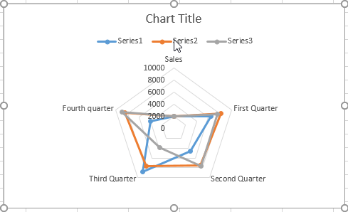
3. Now the original radar chart is displayed in the worksheet as below.
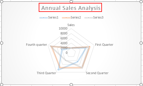
4. Then go to the Design tab, you can modify the Chart Styles, click the drop-down arrow for more information. Here I choose the Style 4, to insert background color for this chart. Also you can rename the title of it.

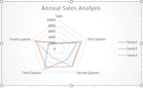
5. Let’s see what will the chart look like after step 1-4.
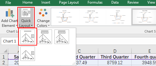
6. Next, click Quick Layout in Design tab, you can change the layout with four choices. Here I choose Layout 1.
7. You can see the radar chart has been completed, and it might be easier for us to do data analysis in Microsoft Excel.

Leave a Reply