
There are many kinds of charts. Different charts present different effects. The bubble chart can visually show the relationship between the three variables. In this article, I will introduce how to create a bubble chart in Excel.
Take this table as an example.

Click any blank cell and click insert, then Scatter or Bubble chart, choose one type you like.

Now we got a blank chart in the worksheet, click the blank chart and go to the Select Data under the Design tab.

Click Add button in the popped-out Select Date Source dialog box.

Add the corresponding dates in the Edit Series window box like the screenshot.

Hit Ok and close the dialog, we got a bubble chart now.

As you can see, the bubbles are crowded. We can adjust the X axis. Just right-click on the chart and choose Format Plot Area.


If you want to beautify these bubbles. You can also right-click one bubbly to open the Format Data Series pane.

Check the box to make every bubble in a different color.

If you want to name these cute bubbles, you can set the value from product cells.

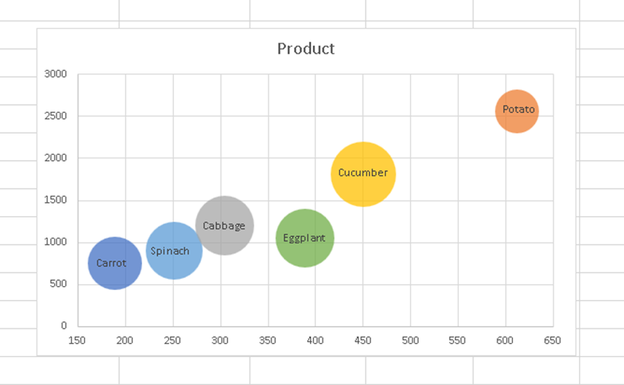
You got a perfect bubble chart now. Hope this can be helpful.

Leave a Reply