Histogram is a direct-viewing type of chart using the width and height of the rectangle to display the frequency distribution of data. It’s very common in daily life and work, which also proves its practicability. Now I want to share the detailed steps to make a histogram in Excel to display the frequency distribution of data.
First you need add a small tool to your Excel.
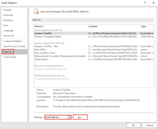
1. Click File – Options – Add-Ins. Choose Excel Add-ins in Manage and then click Go.
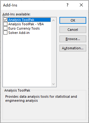
2. Check Analysis ToolPak and click OK to add it.
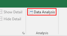
3. You can then find the Data Analysis tool in Data tab.
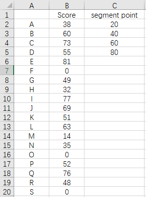
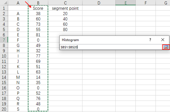
4. Now it’s the time to make some adjustments to your sheet. Taking this grade table below as an example, I want a chart to display the students’ distribution in different ranges of score, so I must set some segment points at first. In my case I add a column called segment point and input 20, 40, 60, 80 in it, which means these students will be divided into 5 ranges: below 20, 20~40, 40~60, 60~80, above 80. Please note you can only set numbers as segment points instead of inputting the ranges (like 20~40) directly, otherwise it can’t be recognized by Data Analysis.
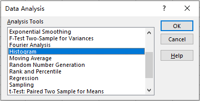
5. Click Data Analysis, the tool we just add. Choose Histogram and hit OK.
6. In the popping out window, check Labers, Chart Output, and choose the place you want to output the new chart. Here I choose Output Range which means the new histogram will be output in a specified area of the same sheet in the same file.
7. Then click the icon in the right side of the Input Range textbox, select the score column and hit that icon again, then the input range has been filled into the textbox directly.
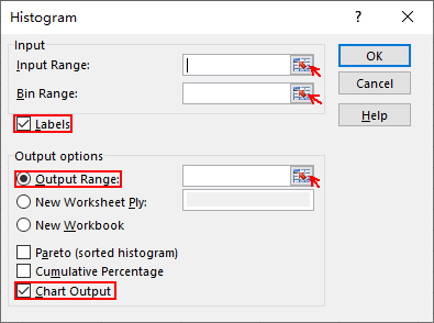
8. You can fill the Bin Range and Output Range in exactly the same way.
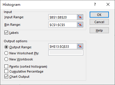
9. Hit OK to apply these settings to your sheet. Now the histogram has been created at the place you specified.
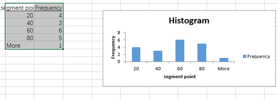
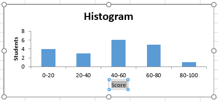
10. You can modify the text of horizontal and vertical axis in the chart.
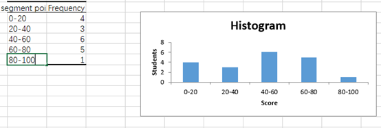
11. For the texts below the rectangle, you can modify them in the table beside the histogram.
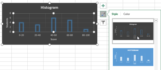
12. Click the histogram and select the brush icon to choose the style and color. In this way you can make the histogram suit your own preference!

Leave a Reply